The company-for-which-I-used-to-work has quite a nice art collection. There is a wide variety of art in all the buildings ranging from paintings, prints, sculpture, mixed media, etc. I just ran across some photos I took about a year ago when I travelled to a remote office. This was a building that had just been finished and they commissioned some very cool artwork for it.
The first is an interactive multi-story LED wall that hangs from the atrium ceiling. At varying times of the day you will find different animations and other abstract graphics being displayed on the wall. It turns out that it’s interactive and uses microphones and video cameras to pick up input from the seating area in the atrium that sometimes affects what’s displayed.
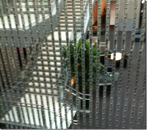
I took some close-up pictures of the LED elements themselves from the second-floor walkway that goes closest to the wall. Unfortunately you can’t see much detail from the fuzzy mobile phone picture, but it consists of a series of discrete LED modules in long plastic tubes.
 There was a particle effect animation running the day I was there. I’ve since seen a number of other animations and abstract images displayed there, some of which react to the sound and movement. The video below gives a decent idea of the size and bad-assedness of this installation.
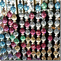
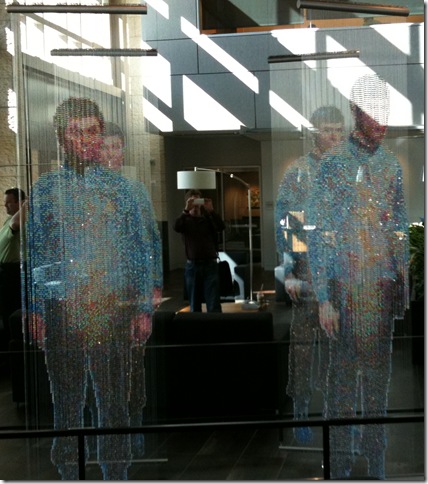
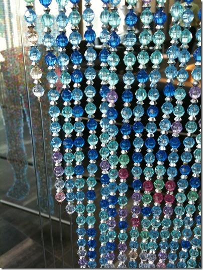
But my favorite by far is not the wall of LEDs, but rather a piece of artwork made from beads. No, my blog password was not stolen by a 70 year old cat lady. I was truly awestruck when I saw the bead art in the lobby, as it presses a couple of my joy buttons simultaneously. First, it’s got the “things as pixels” vibe going on. The pictures are essentially 2D raster graphics rendered with 5mm acrylic beads strung on fishing wire. Second, it’s subject matter is Star Trek. And finally it uses the constraints of the medium to its advantage – the semi-transparent beads used to capture an image of Kirk, Spock and McCoy materializing in the Transporter.

The photo doesn’t do it justice. From afar the shimmering images are stunning and very realistic looking, while close up they turn abstract and all you can see is the process and materials. I’m not sure why the artist decided to use the metal spacers between the beads – perhaps to make it more transparent? Or maybe to make the pixels have a square aspect ratio? The spacers make the vertical distance between “pixels” approximately the same as the horizontal distance.

I’m not above stealing a fantastic idea like this, and bought a bunch of acrylic faceted beads which I sorted by color with the help of my family. I haven’t gotten around to doing one yet, but hope to soon.
