 Who the hell came up with Pin The Tail on the Donkey? And furthermore, why on earth are people still playing this asinine game? The wisdom of taking a bunch of kids, spinning them around until they’re dizzy, then sending them careening around the room blindfolded with the instructions “stick this thumbtack into something” is questionable at best. It’s one of those games like the 3-legged race where the amusement is not so much for the participant as it is the spectators who hope to laugh at some minor tragedy. Both games are based on the premise of performing under constraints – not being able to see, not being able to move freely, etc.
Constraints show up in creative projects often. The choice of medium for an art project will impose constraints, and those constraints force you to think creatively about how to deal with them. Success can come from turning the constraints into an advantage, like the staples sculptures here. Or it can be less about the actual results and more about the Sisyphus-like effort involved in the creation.
I’ve written about making pictures from colored card stock in the past, which imposes some fairly specific constraints. It’s essentially like a variation on a monochrome computer display – you can make any spot either the color of the paper or, by cutting a piece out, transparent. I spent some time recently adapting these techniques for use with my Craft Robo computer controlled paper cutter.
Play To Your Strengths
For this project, I wanted to reproduce photographs using two colors of paper. The top layer of paper would be dark and the bottom layer would be light. The technique I planned to use was to divide up the paper into a grid of many small squares. Then, depending on the brightness of the photograph at any give spot I would cut some portion of the small square out. If I needed a bright spot, I would cut a large square out showing mostly the rear light-colored paper. If I needed a darker spot the square I cut would be smaller so less light would come through, and for the darkest spots I wouldn’t cut anything at all out of the dark paper.
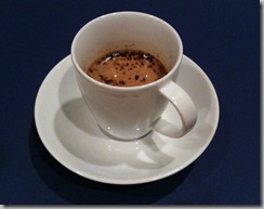 This technique gives the ability to reproduce various shades of brightness, but at the cost of reduced detail. Knowing this, I decided to start with a photograph of a simple object without much detail. If someone tells you to make music with one hand tied behind your back, better to choose singing rather than playing the guitar. So I took a picture of a white ceramic espresso cup. This also had the benefit that there was no color, and thus it would translate well to a monochromatic reproduction.
I then wrote a program that applied a grid to the image and based on the average brightness in each grid cell produced an appropriately sized white square in the cell. Through experimentation I decided to use an 11×11 pixel cell size, which translates into each cell being about 0.15 inch square on the paper.
I had to play with the contrast and brightness a bit to get a good result, but ultimately I ended up with the following. The original image is on the left and the monochrome processed version is on the right:
From Bits to Atoms
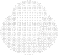
Now I needed to turn the monochrome bitmap into vectors that the Craft Robo cutter can understand. It was a simple matter of importing the bitmap into Corel Draw and then using the Trace Outline command to generate a vector art file:
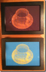
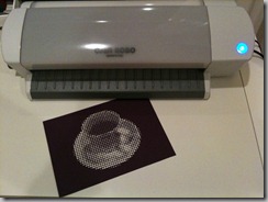
The Craft Robo continues to impress. It took a while to cut out the 835 squares – about 10 minutes or so. But the results were stellar. Each square had nice sharp corners and even the smallest squares, which were just over 1mm wide (about 4/100ths of an inch) cut cleanly. Not all of them cut completely out, so there was a bit of picking pieces out with my tweezers. But after that was done the picture looked pretty good. I trimmed the picture (cut from darker colored paper) and the back layer of bright colored paper and assembled them in a frame.
One More Thing
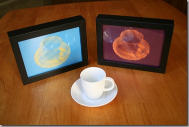
I had another frame on hand, so I cut a second copy from a different color of paper. The final pictures have an abstract pop-art look to them, so it actually looks cool to have two of them in different colors hanging on the wall.
This looks great! Are you planning to release the Paper Pixel software? I’d love to be able to do this with my CraftRobo!
Hi Matthew — thanks for the nice comments.
The software might look finished, but it’s pretty shaky right now. It has hard-coded paths and changing the brightness/contrast requires a re-build of the program, so it’s not something that would be usable by someone else in its current form.
Might look into doing a web app version of it, so folks could use it without having to install the app, .Net framework, etc. I’ll see about that.
Cheers,
/y